Written by: Mica Jorgenson
Previous posts on my Porcupine Gold Rush International Flow-Mapping project here:
A Graduate Fellow Introduction
Maps and Mining: Getting Data Out of ArcMap & the Beginning of Flow Mapping
Part I: Data Drudgery
I know that I am hardly the first Sherman Fellow to lament mind-numbing data management which becomes inevitable at a certain point in a mapping project’s life-cycle. Having successfully sorted out how to make flow maps in Arc, I now just need a complete database to plug in to the software. That means getting enough entries into my “Porcupine Inventory” of moved people, objects, and ideas to make it work. What does this mean on a practical level? In Chapter 1 of my dissertation I argue that the Cobalt silver rush in Northern Ontario (a predecessor to the Porcupine) was an part of an international mining network. One of my supporting pieces of evidence is the fact that the Otago School of Mines regularly sent graduates to work in Northern Ontario – Cobalt was considered a very prestigious placing. The information from the Otago School of Mines comes from a 14 May 1910 clipping in the Otago Daily Times “Otago School of Mines Annual Report.”

I then create a database entry like this:
Name: Norman Fisher
Date: 14 May 1910
How_many: 1
Type: Person
Point_of_origin: Otago, New Zealand
End_point: Cobalt, Ontario
Instigator: Temiskaming Mining Company
Source: “Otago School of Mines Annual Report,” Otago Daily Times, 14 May 1910, 5
Notes: Mine Manager trained at Otago School of Mines
And repeat for ad infinitum as I go through my primary documents. Thrilling stuff.
Part II: Beautiful Betas: Blueshift Map Builder & Ethnic Origin of 1921 Porcupine Residents
As a way of counteracting some of the drudgery, I’ve continued to experiment with different flow-mapping platforms. By far the most exciting has been Blueshift, a simple flow-map browser application which allows you to make beautiful flow maps in just a few minutes. Since the embed function doesn’t work yet (it is still in the beta phase) I took a short screen capture to show how it works. You can also visit the interactive map to zoom around and play for yourself.
The data used here is census information on Porcupine residents’ “place of origin” in 1921. Here’s the original data expressed as a pie, for the curious.
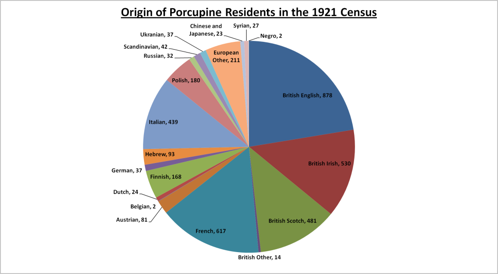
It is hugely problematic for a lot of reasons all on its own – it is unclear if individuals were assigned ethnicity by the census-taker or whether they self-identified their origin (most likely the former). The data also obscures that fact that many people, regardless of how they were identified ethnically, had come from the US. Obviously it also obscures indigenous residents. It thus must be taken with a large grain of salt.
However, I found that Blueshift forced me to make additional oversimplifications I didn’t like. So, for example, the original data lists origins like: “French,” “Scandinavian,” “Hebrew,” “Negro” and “Chinese and Japanese.” Obviously this is somewhat of a mixed bag of continents, nations, and ethnic groups. However, I could only sort my data by city, state, or country in Blueshift. So for “China and Japan,” I had to pick one (I chose China), and I likewise just had to pick a representative country for broad categories like “Scandinavia” and “Negro.” Furthermore, the “world” baselayer uses modern national boundaries and so the application, like many mapping apps, simply does not jive well with historic and/or “messy” data.
On the plus side, it is very attractive. In fact the finished product looks exactly like I imagined my final flow map looking, only better. So I see this as a viable alternative to hard-to-learn programs like ArcMap and QGIS and I think it is even easier and more functional that ArcGIS Online.

Leave a Reply