Written by: Mia Jorgenson
This month I’ve been busy working on two projects related to my Mining & Historical GIS work.
- Learning how to use ArcMap tools (I focused on XY to Line) to make flow maps.
- Getting my data (both existing and forthcoming) out of ArcMap and into a more accessible form.
Adventures in Flow Mapping
My big DH goal for this year is to create a flow map of moving people, goods, and ideas during the nineteenth century gold rushes. The process involves 1) creating a database (in progress), 2) finding an ArcMap tool that can do the job (I settled on XY to Line and/or Utility Network Analyst), and 3) then making the two jive. This month, using a series of online tutorials, I taught myself how to use XY to Line, an ArcMap Tool used for translating X/Y (longitude and latitude) data into lines.
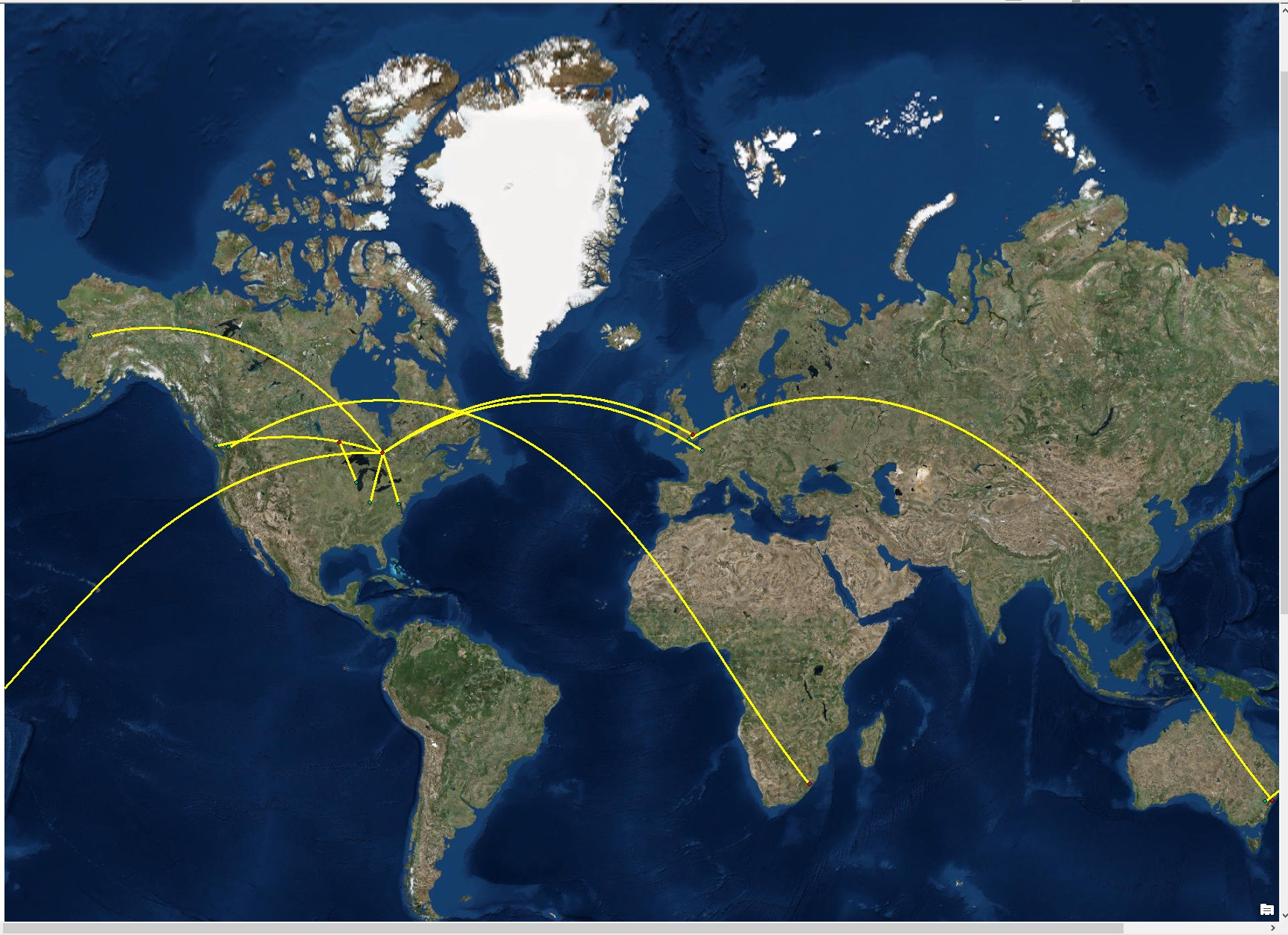
For the purposes of experimentation I used just a tiny part of my database (about 8 moved things). I didn’t use the whole database because I wanted to cut down on the amount of prep/data-cleaning time and get my hands dirty with the tool right away.
XY to Line requires a header with at least five columns: Name, Start X, Start Y, End X, and End Y. I reduced my sheet to just those five categories for the sake of simplicity (the original database includes mid-points, source info, and other extra data). I found longitude and latitude (X and Y) coordinates for the cities at the start and end points using google map’s “What’s Here?” function. Unsophisticated, but it saved me having to learn new Google Sheets geocoding skills. After I had longitude and latitude for each start/end point, I saved my mini-database as a comma delineated file (.csv).
I imported the spreadsheet into Arc using add data -> add xy data and selecting my .csv file. I set the projection to geographic coordinate system WGS 1984. I then opened the tool XY to Line (Data Management -> Features -> XY to Line), imported the table, and told the tool which columns to use for Start X/Y and End X/Y. After a few seconds of processing….success!

(sidenote: I also created a point shapefile for the start and end points here as red and green dots – those are not part of XY to Line)
After playing around with the symbology I was able to get the lines to change colour according to type. So in this case yellow represents things labelled “ideas” in my database, blue is “people,” and “objects” are red. At first glance this screenshot might not make a lot of sense, but rest assured that a polished map with legend is a quick step away in ArcMap’s “Layout” function. The main take-away here is that it is possible (and not that difficult) to get historic flow data to represent in Arc!
I can’t wait to see what this looks like with the complete database, and now regret not just taking the leap and doing the whole thing all at once!
A big remaining problem here is that XY to Line cannot handle more than one start/end point. If an object moved more than once (Michigan to Toronto to Red Lake for example) I need separate database entries for each. That means that if I stick with XY to Line I’ll have a considerable amount of drudgery in excel ahead of me. I’d like to find a tool that can handle multiple stopping points.
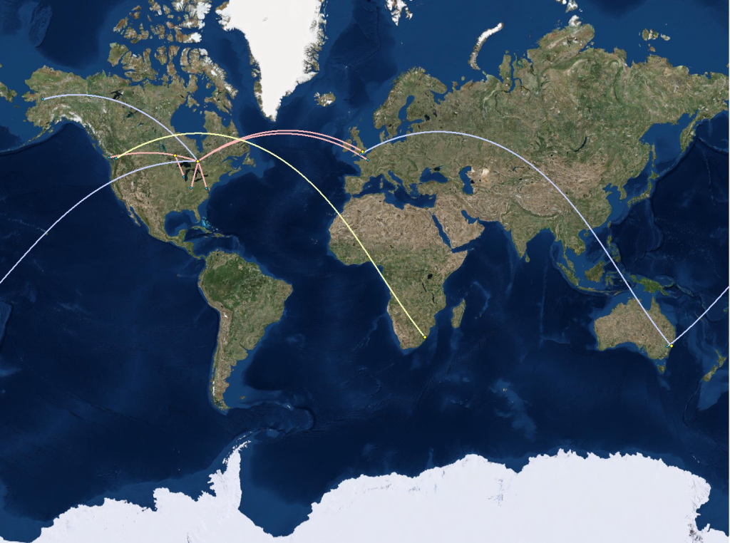
It also seems like QGIS, an open-source mapping program similar to Arc, has a lot more versatility with flow maps. If I can’t find a tool that can handle my data as-is in Arc, I may switch to QGIS for the purposes of this project.
Here’s a list of the tutorials/documentation I used to get this far.
ArcGIS Blog: Creating Radial Flow Maps with ArcGIS
ArcGIS for Desktop (ArcGIS Pro): XY to Line
Alasdair Rae’s Blog “Under the Raedar” has several great posts in flow mapping. The maps on his site are a big inspiration to me.
ArcMap -> ArcGIS Online
As you might know from my last post, I’ve already generated an ArcMap file with a series of historic maps overlayed on modern satellite imagery. This work has allowed me to see historic landscape change over time, especially in local lakes. Knowing about these historic changes has informed my thinking in terms of the dissertation…but how useful is it if I am the only one who gets to see it? ArcMap is expensive, generally only available to members of institutions, and difficult/time consuming to learn. What about members of the community or even other historians who might be interested in my work but can’t access ArcMap?
After consulting with Jay Brodeur, it became clear that ESRI’s ArcGIS Online is probably the simplest way to get my data out of ArcMap. With his help I was able to get my georeferenced historic maps onto a server and into ArcGIS Online. Now the map can be viewed in a browser via a shared link.
The user can switch between maps, zoom in/out, and adjust opacity to compare historic maps to modern satellite imagery.
What I like about ArcGIS Online: Its uncurated. I’m not telling the viewer what to look for or emphasizing any particular narrative. With some exploration and engagement, a user can zoom in and see environmental change in Porcupine. They can draw their own conclusions about its significance, rather than me prescribing any particular interpretation. This way of exploring the past might be particularly compelling for community members who might want to zoom in on local landmarks and see what’s changed.
What I don’t like: The feedback I’ve received has been decidedly luke-warm. Unless you’re familiar with Porcupine it might be hard to know what to look for. Old maps of some obscure place in Northern Ontario…so what? Perhaps a different format – such as a storymap – might be a better way of conveying information. Despite my hesitations about prescribing a particular experience to viewers, a curated experience might be needed for those unfamiliar with my subject or with Porcupine.
People have also complained that the opacity bar is annoyingly hard to find – this is a problem of design in ArcGIS online which probably can’t be changed.
This feels like a huge success despite the luke-warm reception by testers. In a very practical sense I’ve learned a lot about how to translate/communicate my research to non-specialist audiences. I’m not currently doing it very well…but I think I know what to do to get better.

Leave a Reply