
Written by: Mica Jorgenson
Whenever I go to conferences I see other scholars with great maps. They make slide shows and posters look really pretty – but also offer deeper understandings of what is being studied while enabling the scholar to engage more meaningfully with public audiences. As a PhD student in environmental history (a discipline for which spatial data is particularly useful), I have always coveted those maps. But whenever I asked people how they acquired their GIS skills, they told me “I worked for the government for five years before I started my PhD,” or “my undergrad was in geography.” Under the circumstances, it did not seem likely that I would ever be able to acquire the necessary skills to produce maps like the pros.
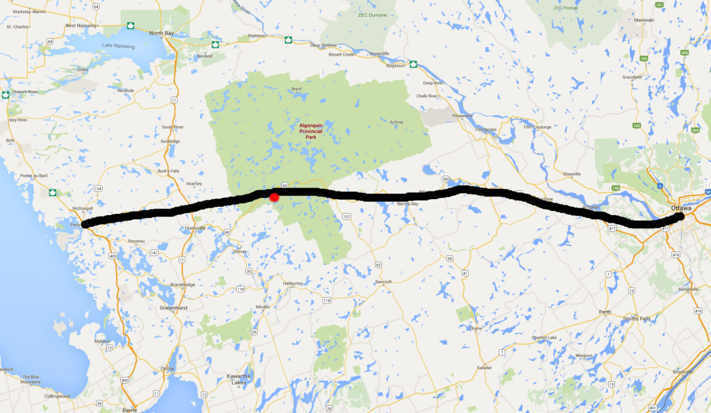
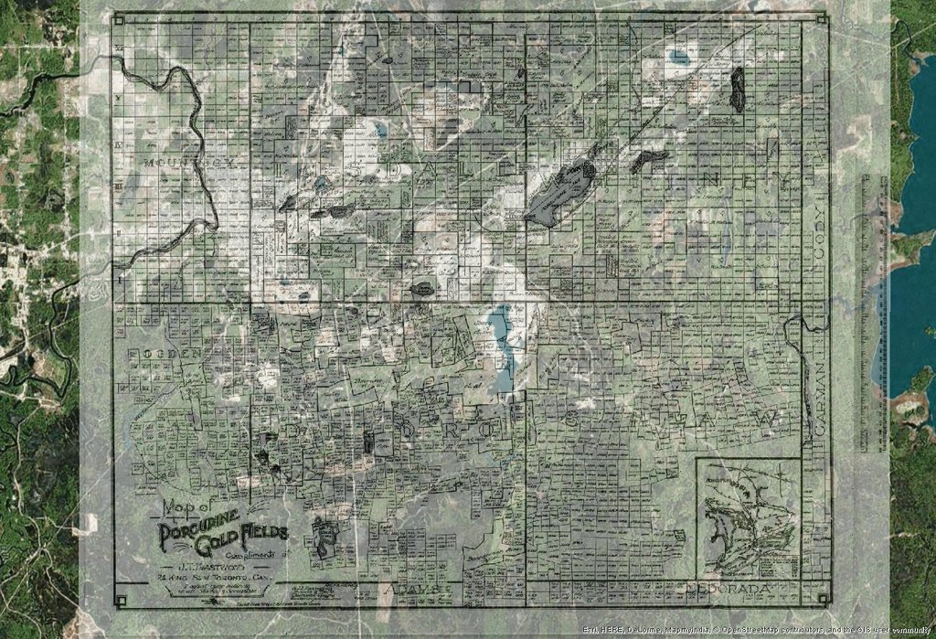
As proof of my hopelessness, take a look at this map of the historic Algonquin Park railway I created just a few short weeks ago. The Sherman Centre has generously provided me with powerful computers and an ArcGIS subscription, but without formal training the most I was able to accomplish was this Google Maps screen shot drawn on in Microsoft Paint.
My lack of ability with historical GIS stems, I suspect, from my complete lack of understanding of the back-end of the software. ArcGIS tutorials, while they have taught me a lot, usually provide ready-to-go data with no errors and no explanation of where .shp files actually come from. Arc was designed for people who know how to use excel and understand longitude and latitude (ie. not me). While I could click through tutorials with pre-fab maps and pre-fab data no problem, when it came to trying to put my own data into Arc I immediately hit inexplicable walls. Worse, I did not have the right language to ask for help. Anything a map librarian said to me went directly over my head.
Luckily for me, the McMaster Department of History funded three of their graduate students (including me) to attend the Digital Humanities Summer Workshops in Guelph between May 9 and May 12. I registered in the “Spatial Humanities” workshop, and my two colleagues (Sarah and Jacqueline) registered in “You’ve got Data” (an intro course to various ways of wrangling humanities data) and “Getting Started with Omeka” (a course that gets you started with the web-platform Omeka).
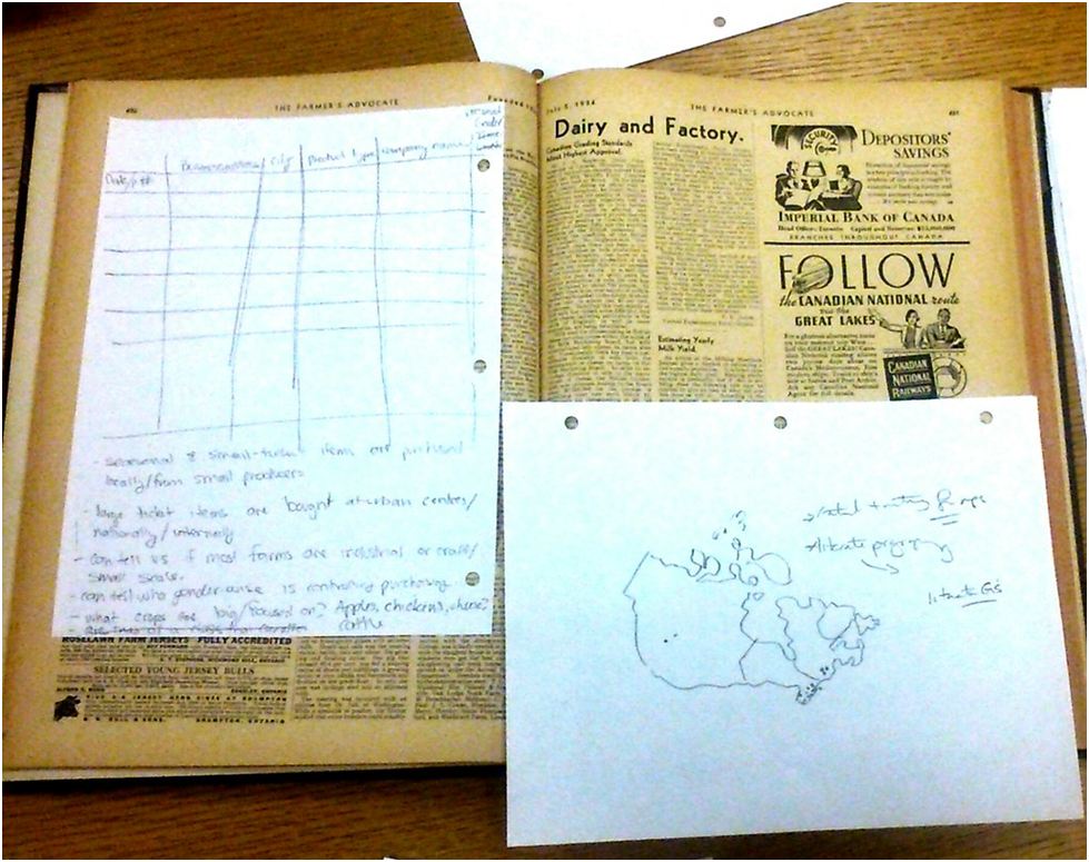
On day one of the workshop, my instructors took me back to the basics. We trooped down into the Guelph archives where we were given primary sources and told to find spatial data. I had the Farmer’s Advocate, an agricultural magazine from the twentieth century. I spent the first twenty minutes staring at its pages, totally baffled as to how something so unintuitively spatial might be rendered on a map. Then things slowly started to occur to me – business addresses from ads could be mapped. From there you could look at the origins of different types of equipment. Or how far afield farmers were willing to buy things from. Or what products were associated with particular seasons. And how all of these things changed over time. Before I knew it I had a spread-sheet full of info and a map of Ontario drafted, with multi-coloured lines flowing in all different directions. Suddenly I could imagine a map.
Over the next few days we experimented with plugging various types of data into different map-making software. By the end of the four days, I could make maps do what I wanted. Sometimes. Considering where I came from, this feels like a great accomplishment. Even better, I can now ask meaningful questions of McMaster’s map librarians so that I can continue to build my skills in the Sherman Centre.
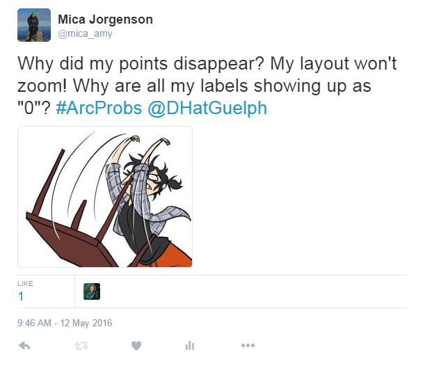
The process was not without its frustrations. On day three, I walked into the computer lab confident that I could georeference my historic map without help…and failed to even load my basic data into Arc. Then random things would go wrong – like ArcMap crashing before I’d saved my edits (twice). I also did a lot of really stupid stuff. Like getting annoyed when my point data disappeared, blaming the software, and calling over the instructor – only to realize that I’d accidentally made them transparent.
On the one hand, it was exhausting. On the other, it was exhilarating. My colleagues from McMaster felt similarly – we all found it difficult to leave our computers at the lunch break and at the end of the day, reluctant to let go of the new thing we were just beginning to grasp. Our daily commutes from Hamilton to Guelph and back became mini seminars on what we learned in our respective courses. On day three, Jacqueline got into the car with a larger-than-usual coffee and a harried look on her face. “I stayed up until four AM working on my Omeka site,” she confessed. The platforms we were learning were so new and so different than traditional scholarship, we found ourselves constantly hungry for more.
We all walked away from Guelph with an enormously useful new toolset for our scholarship. But aside from these tangible skills there were two broader take-aways worth sharing. First, there is a gap between scholars and IT professionals. The kinds of things we did at Guelph could not have been predicted or imagined by software developers (with the exception of those designed specifically for social scientists, such as Omeka and Zotero). The fact that a lot of these tools were not designed for us means we must be creative and thoughtful in how we apply them. If we fail to do so we risk wasting a lot of time and creating a lot of practically useless stuff. I could georeference every historic map in the archives…but would doing so actually be useful? On the other hand, if we think carefully about what we are really doing we create enormously powerful and valuable new lenses through which to view our sources. If georeferencing every map in the archives allows me to trace historical change on a landscape over time by lining up its essential features in a way I couldn’t do without the software, it has done something worthwhile. And by making good use of digital tools we lay the groundwork for a better integration between technical and human disciplines.
Second, before going to Guelph some part of me still clung to an unrealistic expectation that the digital world held all the answers. This notion was thoroughly trampled on at the workshops. Our instructors were extremely knowledgeable experts, but even they were occasionally stumped by things happening in Arc. The lesson here is that even though we think of data and computers as clear-cut and logical, this stuff is actually very messy. Unexpectedly, this messiness is the digital humanities’ greatest virtue. Data have a life of their own. Proposing a digital project is just like posing a hypothesis – it could very easily be wrong, and we need to be able to accept and make use of what remains. This is a useful exercise, and a familiar one. Digital humanities, like our traditional research tools, provoke more and deeper questions of our work, but they won’t give us easy answers.
My colleagues and I returned to McMaster with new tools and renewed excitement about our work, which I hope we can pass on to our colleagues and students. We are grateful to the Department of History for supporting our participation in the DH at Guelph workshops. We are also grateful to the instructors and organizers for providing such a useful, educational, and fulfilling event. We can’t wait to learn more next year.

Leave a Reply