Written by: Samantha Clarke
*I don’t have eight separate rules, but I was told to create an “engaging title” so here we are.
My name is Sam, and I’m a doctoral candidate in the History Department here at McMaster. I specialize in Cold War medical history and international relations. My SSHRC-funded research examines how the fight against poliomyelitis fit into international and transnational relations between divided Germany and its occupiers between 1947 and 1965, exposing the ways in which politics and ideology permeate supposedly “neutral” areas such as science and healthcare. I completed my B.A. (Hon.) here at Mac, and my MA at Western University.
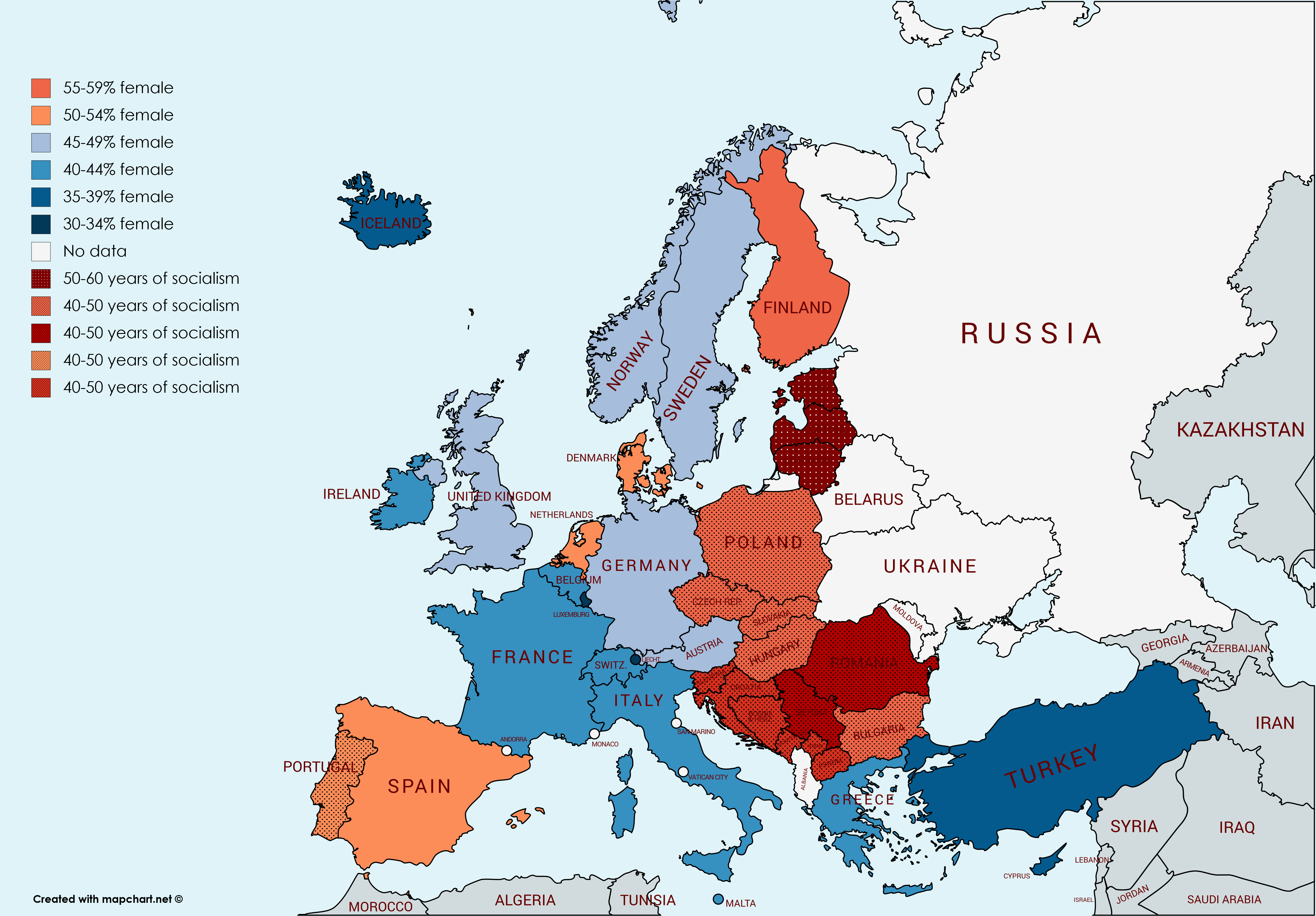
Recently, at the McMaster History Department’s graduate student conference, I presented a paper on female physicians in the USSR and satellite states. At one point in the talk, I showed the following map I created using 2015 data from Eurostat and mapchart.net:

After the presentation concluded, I received many, many questions about the map: did I make it myself? How? Where? Was it very time-consuming? Truth be told, making the map took about 15 minutes and very little mental strength. As well, it is not perfect. Ideally, I’d like to be able to create multiple separate legends to convey different information, such as the meaning of colour vs. texture which isn’t as clear here as I wanted.
Anyway, the problem is, these people now think I’m some sort of map deity and they want a whole bunch of information that I’m just not equipped to provide. I feel like a GIS fraud. They’re asking me questions about mapping historical areas where the landscape has changed, mapping populations that don’t live within national boundaries, mapping in oceans – all sorts of things that I do NOT know.
Then I realized: the group of map-thirsty graduate students circling my desk is a sign of two things. Firstly, all of these people are interested in learning how to create maps using GIS tools, and secondly, they have no idea how to begin the learning process and that freaks them out. They’re more afraid of GIS than I am of them figuring out I know basically nothing.
What attracts people to GIS is the end result. The map is compelling and conveys about 16 spreadsheets’ worth of information in one image (insert “picture is worth a thousand words” joke here). It is easy for non-historians to understand what the image is meant to convey: females are the majority of physicians in those countries that are a shade of red. I think the connection to socialist histories is less apparent, as the textures on this map do not jump out as much as the colours. I look forward to exploring other resources with more options for adding these sorts of nuances.
What concerns people about GIS is that it all seems so complicated. Where does one begin? So here, I am actually able to provide a concrete answer: Mac is blessed with a great Maps, Data, and GIS Centre at Mills, as well as the Sherman Center. But for anyone without these resources, there’s still hope! So far, I’ve started with reading blogs online, watching Youtube videos (just search GIS tutorials for beginners and find your favourite voice/presentation/approach), and have just recently signed up to audit an online MOOC (massive open online course) on the fundamentals of ArcGIS. We are uniquely situated to take advantage of the online era – making learning a lot easier and accessible. For more open-source, i.e. free, options, check out this GIS Lounge blog post.
I should mention that you can map things very well, or very poorly. Graphical literacy is important and recognizing the differences between information conveyed effectively and information conveyed misleadingly is important. I can recommend books if anyone’s interested in learning the rules of data visualization. If you’re into this kind of stuff and you’re looking for entertainment rather than a reading list, check out #badgraphs on Twitter. Or if you’re really interested in procrastinating, try the Cartastrophe blog – they’ve been dead for a while but the blog has plenty of bad maps to binge with clear explanations for each one’s shortcomings.
Basically, my point is that there are easy ways to get into mapping stuff that are free, fun (depending on your idea of fun) and fantastic for conveying research to wider audiences. This is how I am approaching the topic so far, and I’m looking forward to sharing the results with you in future blog posts. I’m awful at ending things so here’s my best attempt at a bad map and also an excuse to post a photo of Gus:

Leave a Reply